


A Cause for Celebration
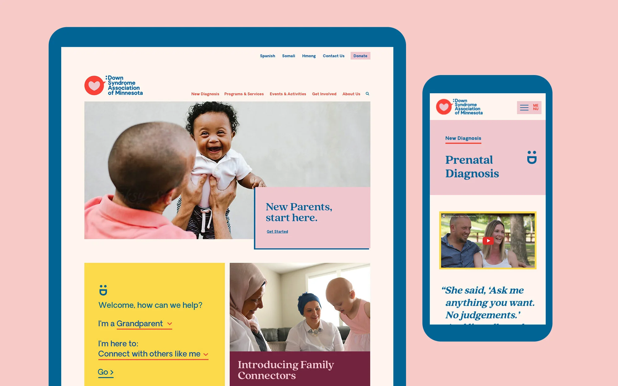
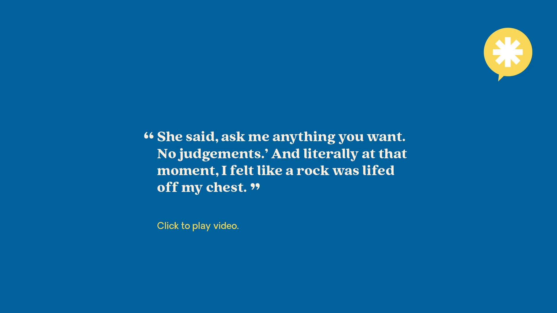
The Down Syndrome Association of Minnesota (DSAMN) comprehensive visual identity and website rebrand is a visual experience that draws the user in with the same warmth and support that they would receive from a DSAMN family connector or peer support group. The new logo system pairs bold and clean typography with a conversational bubble full of love. The type treatment, which combines a colon and the letter D (as in Down), is a reference to the texting abbreviation for a smile. This simple emoticon reflects the sense of support and positivity that’s present in everything DSAMN does.
The colorfully revamped dsamn.org -- in bright pink, yellow, and blue with playful icons -- serves as a central hub for all social media and email communications. The bold, pop art nature of the web design and identity system is intended to function as a badge of honor, showcasing the sense of pride in Minnesota’s Down syndrome community.
View Site: dsamn.org


Project Scope:
Brand Strategy / Creative Direction / Identity System / New Parent Collateral / Content Strategy / Website UX and Design / Website Development / Content Management System Integration / Photography Art Direction / Social Media Design Direction